ALIMENTA
Alimenta | 2024 | #VISUALIDENTITY #REBRAND
Objective: Visual Identity Redesign
Alimenta is more than a brand that serves food — it’s a brand that nourishes care, warmth, and connection. When I was invited to revisit its visual identity, the challenge was clear: how to evolve a well-loved brand without losing the emotional flavor that made it special.
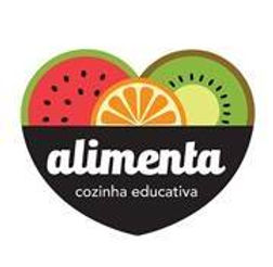
The original logo, a colorful emblem wrapped around a handwritten wordmark, carried the charm of something homemade and heartfelt. But as the brand grew, so did its need for versatility and strategic clarity. It was time to cook up something new — something that could speak the visual language of today’s students: the Alphas and early Gen Zs.
I began by diving deep into the existing identity and the competitive landscape. From the vibrant chaos of food brands to the bold aesthetics of youth culture, I drew inspiration from collage-style visuals, urban typography, and the raw, playful energy of the “TikTok generation.”
The result was a refreshed identity system — one that keeps Alimenta’s original warmth but serves it with a contemporary twist. The new design embraces adaptability: vibrant colors spread across applications instead of being confined to the logo, typography is clearer yet expressive, and every element is designed to grow and evolve with the brand.


Alimenta’s new look is a balance between human and modern — a brand that continues to care, welcome, and feed, now with the visual flavor of a new generation.